Generates a pie chart or donut chart from input data.
Usage
pie_chart(
  input,
  var,
  var2 = NULL,
  type = 2,
  show_freq = FALSE,
  color = NULL,
  palette = "jama",
  title = NULL,
  text_size = 10,
  title_size = 20,
  add_sum = FALSE
)
Arguments
- input
Input dataframe.
- var
Variable for the chart.
- var2
Secondary variable for donut chart (type = 3).
- type
Chart type: 1 (pie), 2 (donut), 3 (PieDonut via webr).
- show_freq
Logical to show frequencies. Default is FALSE.
- color
Optional color palette.
- palette
Color palette name. Default is "jama".
- title
Plot title. Default is NULL.
- text_size
Text size. Default is 10.
- title_size
Title size. Default is 20.
- add_sum
Logical to add sum to labels. Default is FALSE.
Examples
# Simulate data
set.seed(123)
sim_data <- data.frame(
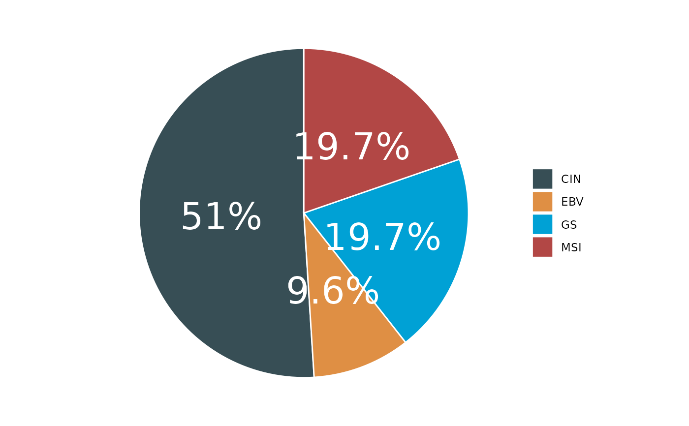
Subtype = sample(c("EBV", "GS", "MSI", "CIN"), 100, replace = TRUE)
)
# Create pie chart
p1 <- pie_chart(input = sim_data, var = "Subtype", palette = "jama")
#> ℹ Available categories: box, continue2, continue, random, heatmap, heatmap3, tidyheatmap
#> ℹ Box palettes: nrc, jama, aaas, jco, paired1, paired2, paired3, paired4, accent, set2
if (!is.null(p1)) print(p1)
 # Create donut chart
p2 <- pie_chart(input = sim_data, var = "Subtype", type = 2)
#> ℹ Available categories: box, continue2, continue, random, heatmap, heatmap3, tidyheatmap
#> ℹ Box palettes: nrc, jama, aaas, jco, paired1, paired2, paired3, paired4, accent, set2
if (!is.null(p2)) print(p2)
# Create donut chart
p2 <- pie_chart(input = sim_data, var = "Subtype", type = 2)
#> ℹ Available categories: box, continue2, continue, random, heatmap, heatmap3, tidyheatmap
#> ℹ Box palettes: nrc, jama, aaas, jco, paired1, paired2, paired3, paired4, accent, set2
if (!is.null(p2)) print(p2)
